Introduction
Today’s movie streaming services think they know what we want to watch. They employ machine learning techniques to track our preferences and makes suggestions to keep us watching. Have you ever tried to find a movie outside of your suggested watch list? Did you know between 1990 – and 2017 approximately 45,000 movies were produced?! Our team created a Find Your Movie dashboard to filter through and display the top 5 movies by average voter rating. The filter options allow a user to narrow down the selection of movies based on criteria for language, genre, year released and run time.
Our team also built a second dashboard to learn more about the top 100 most popular movies. The “What makes a Good Movie?” dashboard displays visuals on budget, revenue and genre. Are the most popular movies isolated to a few specific genres? Does a larger budget correlate to a higher voter rating? Do the movies that do the best at the box office also have high ratings?
PowerBI Report
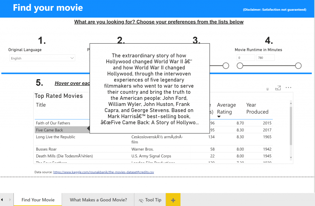
Page 1 dashboard: Find your movie
Four slicers to help the user narrow down what type of movie they are looking for:
- A slicer for what language the film should be in
- A slicer for genres of films
- A slicer for the year the films were released
- A slicer for the runtime of the movie (in minutes)
A table showing the top–rated movies based on the criteria chosen in the slicers
Page 2 dashboard: What makes a good movie?
- A scatter plot with trendline showing average rating as a function of budget
- A scatter plot with trendline showing average revenue as a function of budget
- A column chart showing average revenue as a function of primary genre
Behind the Scenes:
The data set
The movie data, obtained from Kaggle.com, consists of 45,000+ movies released before July 2017, along with their genres, budgets, revenues, release dates, languages, production companies, countries, vote counts, vote averages, and more.
A second data set of language codes was uploaded to link language codes to the names of languages by establishing a one-to-many relationship. For example, “en” could be shown as “English.”
The dataset can be downloaded here: https://www.kaggle.com/rounakbanik/the-movies-dataset#credits.csv
Using the Query Editor

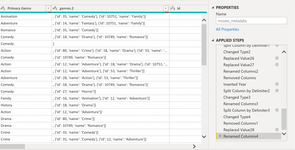
You can see from the image above that there were several genres listed in a single column with brackets between them. We used the query editor to separate the first genre into a new column labeled “Primary Genre” with the split column by delimiter function, then cleaned up the values with the replace function.

Hovering over any movie title on the first page reveals a tool tip that provides the movie overview. The tool tip is a hidden page on the dashboard with a data field for the overview. We thought the tool tip was a nice touch for providing more information without overloading the visuals that appear on the screen.
Credits:
This dashboard and report was completed as a group project for the Advanced Data Visualization class in the MBA program at the Darla Moore School of Business. There were 3 members in my group that contributed to this project.
