Project Description
OVERVIEW
DPX Technologies wanted to rebrand in order to compete with larger more established competitors, accelerate growth, and position the firm in new market segments. DPX needed to combat the perception of being a small firm and increase brand awareness as an innovative leader. DPX currently sells in 3 main market segments: Forensic Toxicology, Clinical Laboratory Medicine and Food Safety, where solid phase extraction and filtration methods are commonly known and used for a variety of applications.
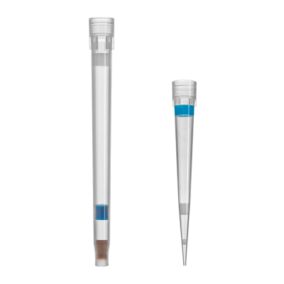
Since the core product offering is a pipette tip, DPX products received a new trademarked name known as INTip™. Product lines include INTip™ Solid Phase Extraction and INTip™ Filtration.
New Markets:
The future of DPX lies in the proteomics and genomics industries. INTip compliments the core technology and delivers the brand expansion for pipette tip products in market segments where automated sample preparation is highly sought after. Pipette tips are easy to use and easy to automate, which will increase efficiency, robustness and reproducibility for protein purification and DNA purification.
PROCESS
I started this project by evaluating the current brand system, and talking to owners, investors, employees, and stakeholders.
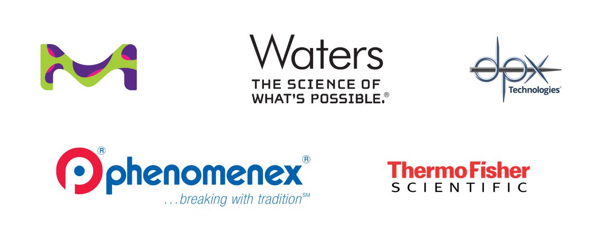
Review of relevant logos in the industry compared to the DPX brand:
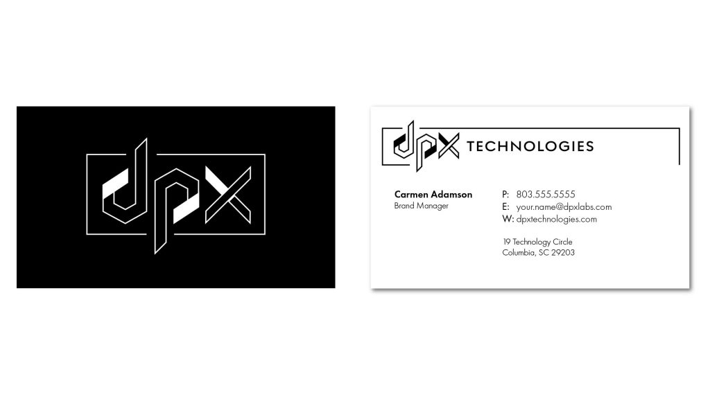
I worked on updating the logo and brand identity system. Below are some logo concepts and a business card concept that did not make the final cut.
LOGO CONCEPTS:



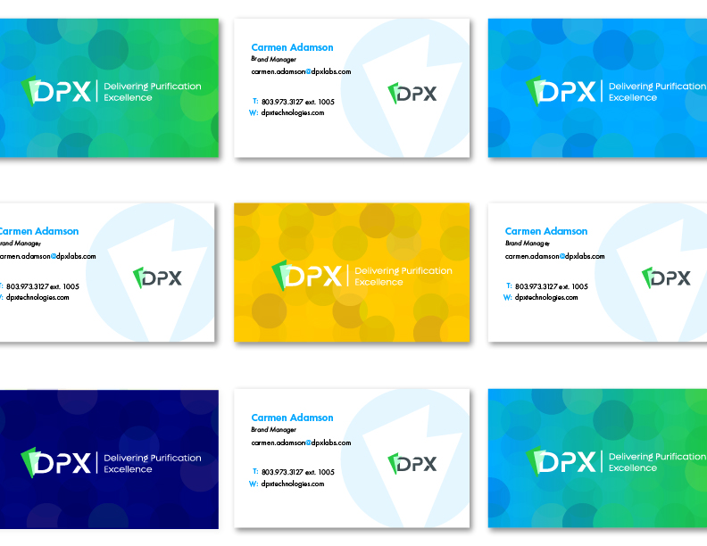
The cards were printed on 19 pt paper with a soft touch coating and a UV raised spot gloss on the logo on the back. I ordered the business cards from MOO. I like the quality of their printing and they had the best price! They also allow you print multiple designs for the back, so I took advantage of this and used four different colored backs.
SOLUTIONS
Logo, Color Palette, Pattern and Graphics:
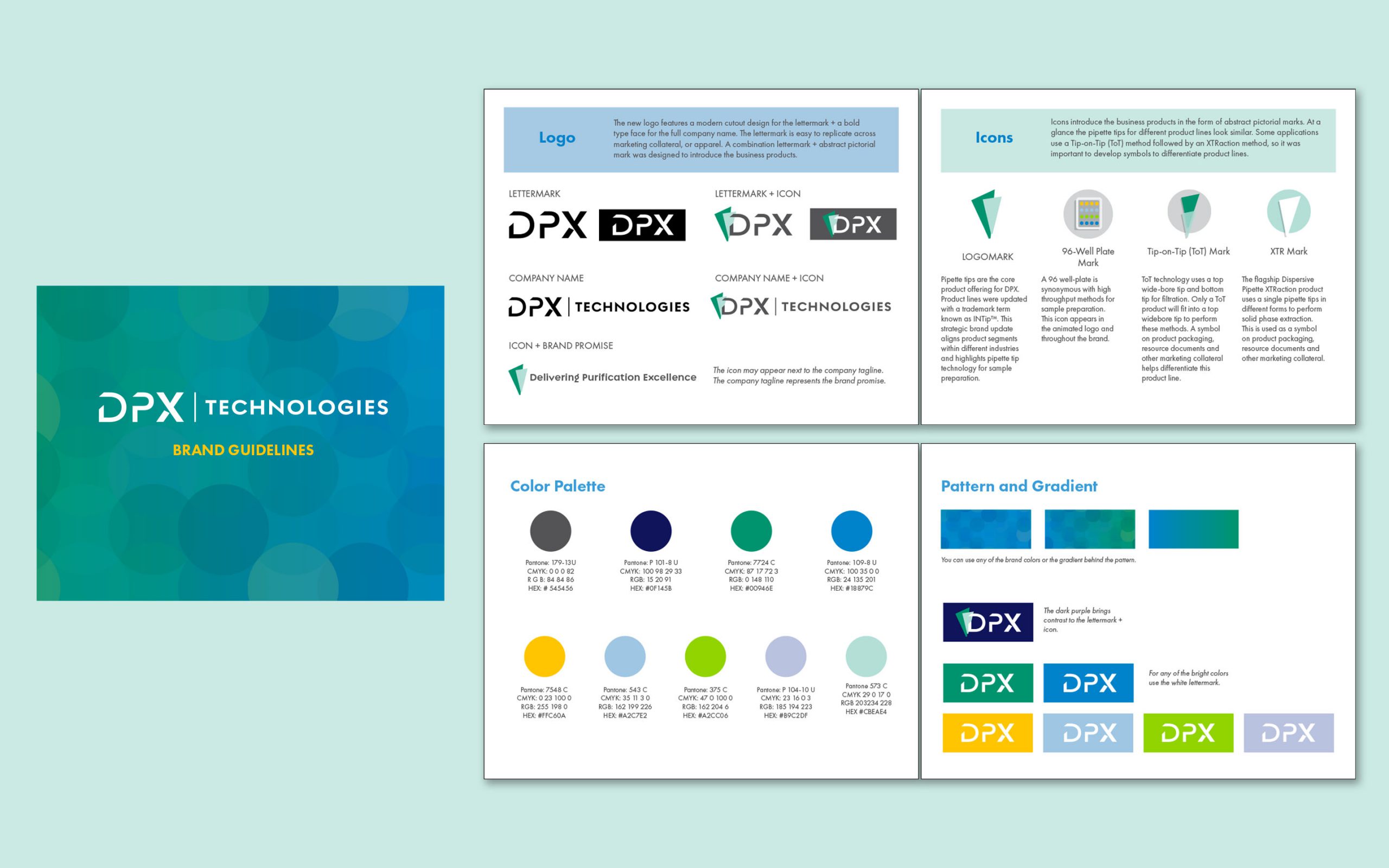
The new logo features a modern cutout design for the lettermark + a bold type face for the full company name. The lettermark is easy to replicate across marketing collateral, or apparel. A combination lettermark + abstract pictorial mark was designed to introduce the business products.
Icons introduce the business products in the form of abstract pictorial marks. At a glance the pipette tips for different product lines look similar. Some applications use a Tip-on-Tip (ToT) method followed by an XTRaction method, so it was important to develop symbols to differentiate product lines.
I wanted the brand colors to be fun and vibrant. The addition of the pattern gave me some graphics to associate with the brand. I envision changing the colors and the blend mode of the circles in the pattern, so they never have to be exactly the same every time. This changing content is synonymous with the level of customization offered by DPX. There are endless possibilities to the combination of tip and sorbent chemistry options, and DPX offers custom solutions to each client depending on the requirements needed by that lab. This is a product and service differentiator from what is offered by the competition.
Web Design:
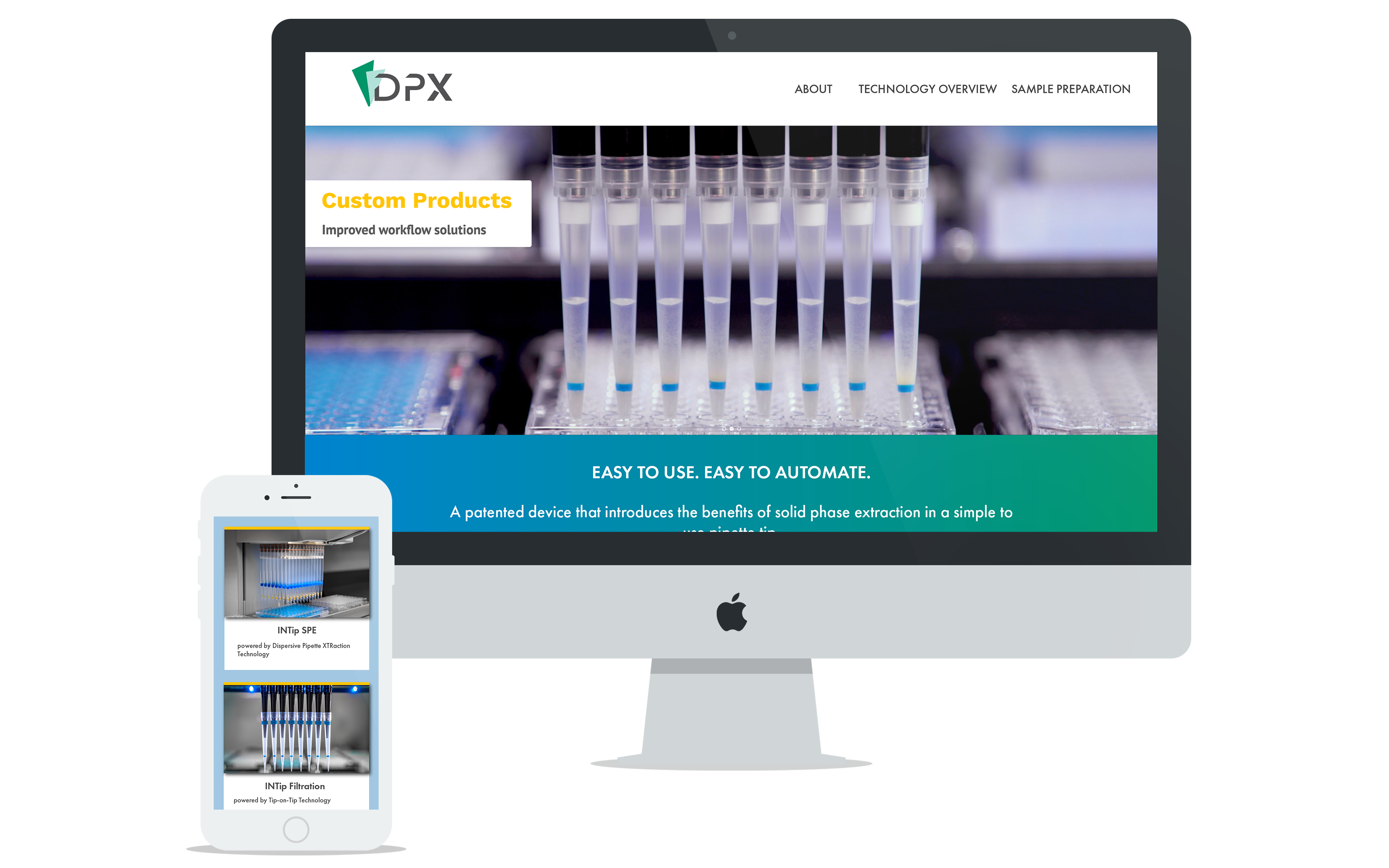
I took the new brand guidelines and applied them to the website design. The new website is built on WordPress with a customized Avada theme. I picked the Avada theme for DPX since I have a strong background on building sites with it. Avada has a wide range of controls and I like the user interface much better than the WPBakery page builder.
Redesign Process Outline:
- Took inventory of existing content and added content to fill in gaps. Created a site map document to visualize the content and page hierarchy with the management team
- Created wireframe mockups to visualize the layout for content
- Created high fidelity mockups using graphics and images for key pages like the home page, and product landing pages.
- Started creating in a development site until content was ready to launch
During the development stage I was able to share the link with management and key stake holders to elicit feedback. I also shared the link with marketing colleagues outside of the biotechnology industry to get feedback on the creative design. The new website has met or exceeded all performance metrics and been a great tool for lead generation especially during the pandemic.
Updated Videography:
I worked with Zero Gravity in Columbia, SC for the videography. I have worked with this company in the past on projects for previous employers and they have always been able to capture my vision. I knew they had the equipment necessary to capture closeups of the action inside of the tip as it aspirates a liquid and mixes the sample solution. This level of detail was crucial to telling the story behind the technology of INTip sample preparation. I used this footage to create content for the website and digital marketing campaigns.
I edited the video loop at the top of this page using Adobe Premier Pro, which was used as the header on the automation landing page for the DPX website.
Here are some links to more videos on the DPX youtube channel produced by Zero Gravity with my creative direction.
Zero Gravity also produced this logo animation and truly brought my vision to life.
Updated Product Photography:
I used S. Andrews Photography for all of the new product photography. I chose S. Andrews because I have worked with him in the past and he has a strong portfolio of images for industry and research. He also has mad photoshop skills, which came in handy for editing. Photographing plastic is pretty difficult. I worked in his studio to capture these individual tip product photos. We had a special glass light box setup to light the tips from the bottom as well as the sides.
